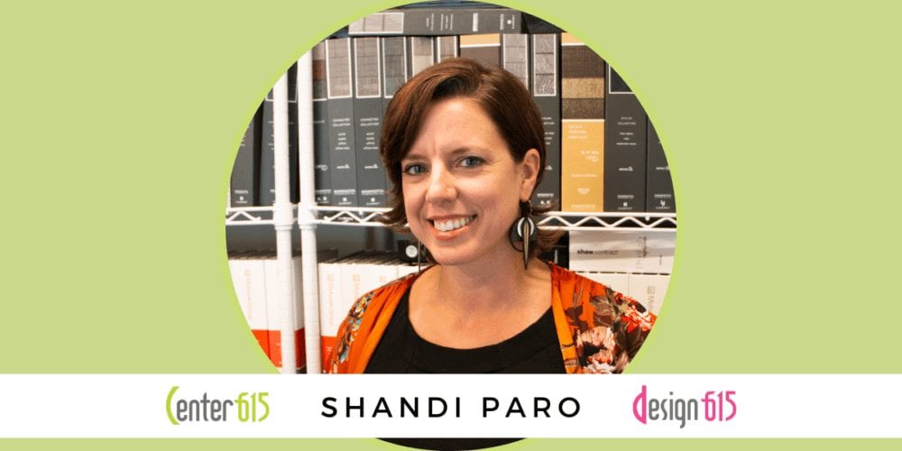
Design 615 founder Shandi Paro shares plans for the former Art & Invention Gallery building, the inspiration for Center 615’s Wall of Heads, and the reason our Main building has an intricate layout.
Shandi Paro’s design experience in Nashville is 15 years strong, with her own boutique firm Design 615—a solid party of 2—celebrating 3 years of success. She decided to leave her previous design job at a larger firm to start her own business in order to focus on what she feels is important about the industry.
She dived into design to have a fulfilling career that was creative and had no redundancy; childhood memories of her grandmother constantly refreshing her interior décor also pushed her in that decorative direction.
Her favorite part about the design process is the pre-design work: the beginning stages of collecting the data, learning about a new group of people and their needs, and starting the design narrative for their new space.
Shandi stresses, “The client is as much a part of the process as the design team is. They’re the person that’s going to live in the space. They need to love it or…what were you there for?
We are not one of those firms where you walk into a room and think, ‘Oh, this has got to be a Design 615 project!’ We’re not trying to put our “stamp” on things. We’re just trying to make the world a better place one space at a time. We want people to be happy and have their surroundings embody them, their culture, and their vision.”
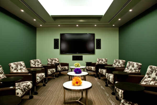
Shandi’s design hands touched all of the Center 615 buildings, select Nissan Stadium private suites, numerous restaurants, and most recently the renovations for the former Art & Invention Gallery.
Read on for a more in-depth conversation on Shandi Paro’s continuing interior design journey.
. . .
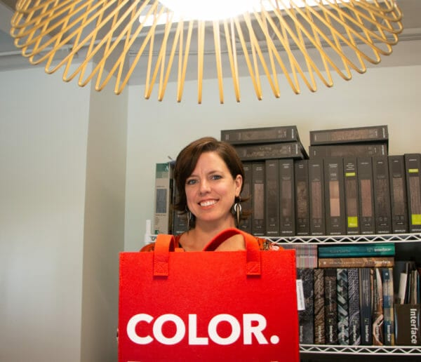
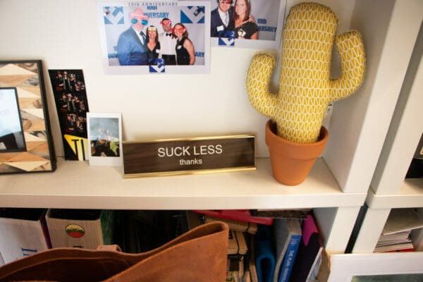
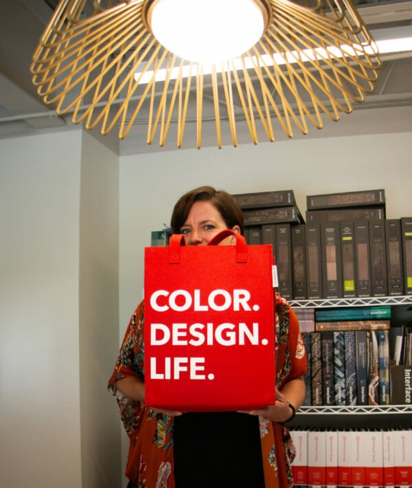
For the interview, Shandi allowed me the privilege of visiting the Design 615 library among the B suites in the Main building. Not only does the library contain stacks of design books chock full of colored and textured swatches of various sorts of things, but little knick knack gems also litter the space. It is truly a small wonderland for the designing imagination.
Shandi herself screams modern flower child: always wearing flowing dresses decorated in blossoms and pretty patterns, silky psychedelic headscarves, and fashionable chunky earrings dangling above her shoulders. Open minded and free spirited, Shandi showed me a sheet of paper where she jotted down notes for the interview in bright pink highlighter.
. . .
Andra: You designed large parts of Center 615’s 4 buildings (Bricks, Main, Loft, and the green room at Studio 615). How did that job happen to fall onto your shoulders?
Shandi: The owner of this building has been a client of mine since 2008. So, I have done all of his work since his first commercial project in East Nashville, over at the 17th and Fatherland building. First came that building, and then I helped him with the Bricks building.
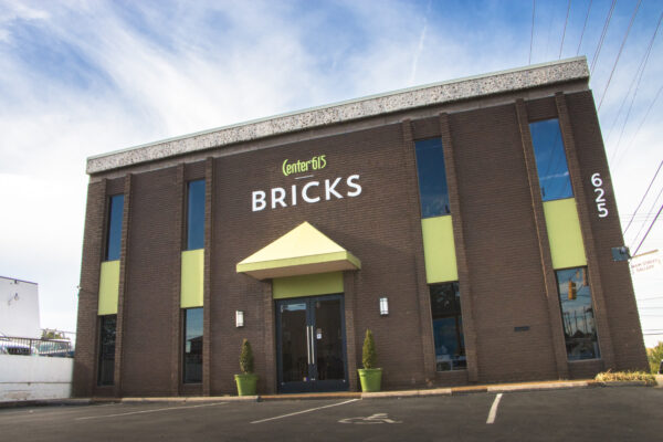
Bricks was the first co-working building Christian owned, originally named Paro South Creative Suites.
During all that time, we were strictly clients, but before he bought the Main building [in December 2012], we had been married for about a month.
A: Where did the inspiration for this unique spaceship design come from?
S: Several places. In a dream, Christian had a vision about what the outside could look like. Immediately after he woke up, he drew a sketch, and that led to the spaceship theme.
Inspiration for the design always comes from the client—with any project, but the original exterior of the Main building was in this time capsule. There were ideas about covering it up and changing the look of it, but we ultimately decided to embrace the exterior’s crazy and weird angles that were already there.
The Main building was even more like a maze when we first got it from Hardaway Construction, but to be able to take what was already here and not completely wipe it out is good for sustainability and avoids wastefulness. The design is a prime example of adaptive re-use.
A: Design 615 did not yet exist when you first took on those projects. Can you tell me about how Design 615 came about?
S: I’ve been doing design in Nashville for 15 years now. I had been with one firm for a long time, but after a series of spontaneous events and with Christian’s encouragement, I ventured out and started my own business to focus more on what I felt was important about design.
Despite my own opposing feelings, I thought to myself “I’ve got at least 30 more working years in me. So what if I get it wrong this time? I’ll know I tried.”
Within the first 9 months, I realized that I clearly needed a team. The timing worked out perfectly to add Tyler on board the adventure of a new business.
We just hit our 3 year business birthday! Our internal hashtag is #itsorganic
A: So how did you become involved in interior design?
S: I wanted a fulfilling career that was creative and had no redundancy. Design was always in the back of my mind—from childhood memories of my grandmother always re-arranging her furniture and changing her spaces. I also job shadowed one of my grandmother’s clients who was an interior decorator in downtown Bowling Green, KY, which is where I’m from.
A: How did you go from Bowling Green to Nashville?
S: I moved to Florida when I was 18, went to school at IADT Tampa, and took time off to live and love the ocean. When I finished school, I moved up here and got my first job, which I worked at for 10 ½ years.
A: Design 615’s website says you have “global outreach”. Does that mean you have international clients?
S: Yes, we have international clients. We love to travel. The most unique travel I did was last year for a project in Beirut, Lebanon. During the course of the project, we did 2 trips out there that were super fun.
However, the project came to a screeching halt because the CEO of these international projects was arrested. It was all over the news. He’s still under trial, so the saga continues; though, I don’t think the space is going to be finished.
I didn’t get a lot of time to wander there. I was only there for a couple days, mostly spending my time in meetings, and of course had jet lag. It was a really cool place; they call it the Paris of the Middle East. Everyone there is super stylish. There is no t-shirt and jeans thing going on.
They’re a very loving group of people. They’re also big celebrators, living life to its fullest.
When my client and I were out eating at a restaurant with live music, a group of women celebrating somebody’s birthday grabbed both of us to join them to dance!
A: What other international projects is Design 615 working on?
S: We have a cool ongoing project in Toronto, CA; it’s an old building that hasn’t been renovated in 30 years, so we’re redoing it step by step. So far, we’ve done 3 renovations, and there’s about 3 to go.
It’s incredibly multi-cultural up there. They take into consideration things like prayer rooms, and there’s authentic ethnic food everywhere.
A: What’s your favorite part about the interior design process?
S: The pre-design work: the beginning stages, collecting the data, learning about a new group of people and what they need to be successful, and starting the narrative for how their new space will be is what I love.
I also loooove lighting. Like, I could spend someone’s entire budget on lighting. The finish part is really fun, especially when there’s so much new product coming out.
To stay on top of all the new products and stay in the know, we have really great reps that come in and show us everything. As an interior designer, you’re kind of an extended sales force for all these product reps.
There’s a million things out there, and you’re narrowing down to 3 or 4 options for your client to look at. You’re curating this big design ball of awesomeness for them.
The client is as much a part of the process as the team is. They’re the person that’s going to live in the space. They need to love it or…what were you there for?
We’re not one of those firms where you walk into a room and think, “Oh, this has got to be a Design 615 project!” We’re not trying to put our “stamp” on things. We’re just trying to make the world a better place one space at a time. We want people to be happy and have their surroundings embody them, their culture, what they’re going for, and that realm of things.
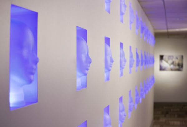
A: How did the Wall of Heads in the basement level of Main happen?
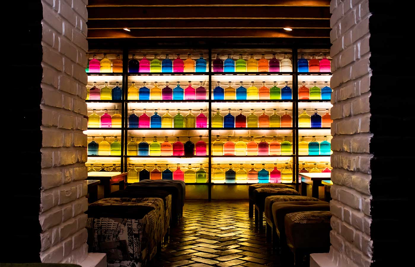
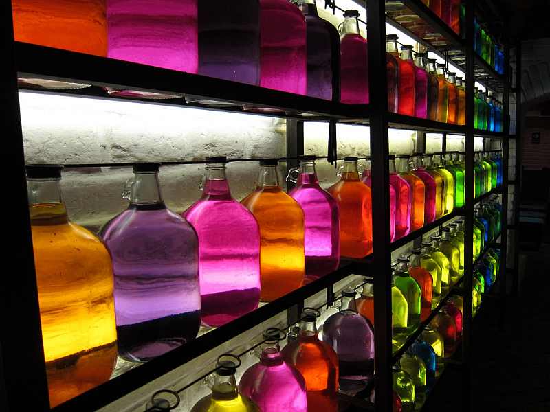
S: That was a collaboration with my client. We were on our honeymoon in Lima, Peru at this really cool old historic mansion converted into a restaurant/bar, called Ayahuasca Restobar, that had all these super charming rooms. We sat down in the basement—where there weren’t any windows, but they created light using this massive glowing feature wall of these huge backlit clear growler jugs all filled with differently colored water. It just glowed all these different, fun hues.
We knew we wanted a feature wall there at Main, but we didn’t know what. I like lots of things on a feature wall. Instead of 3-5 things on display, I like 27 of them. We reserved the space, and then Christian found these glass wig heads for sale. It’s a slight homage to my obsession with wigs.
With the glass wig heads, through Coburn’s Exclusive, we turned it into a custom head wall with color-changing lights, picking up inspiration from the Ayahuasca Restobar in Lima.
Travel is what inspires me. You pick up all these different things from all these different places, and then you put it all in the tumbler, shake it up, and pour it out.
A: Can you tell me more about the 2 private suites at Nissan stadium you worked on?
S: When Nissan got the naming rights for the stadium, none of the private suites had been updated since the stadium was built in the early 90s. We were hired to renovate 3 of Nissan’s private suites between seasons, and it took 3 different phases.
The owner of the Titans saw our work and hired us to renovate her suite as well; that renovation was the most interesting of all of them. One thing that all of the suites have are these really low ceilings, between 8 and 9 feet. Normally when we would take out a suite’s ceiling, there would be the floor above it. When we took out the her ceiling, there was a huge angle of the bleachers above the suite. We wound up getting a ton more volume than we expected; it pitched up to around 18 feet in the back.
There are always surprises in design. Usually, they happen after demolition; we call them “fun opportunities to make a design change”. With that case, we decided to play with levels and layering.
A: Let’s talk about Family Wash. You designed that, but now it’s gutted. How does that feel?
S: I have done so many make-believe projects, that you wouldn’t believe. When you put your heart and soul into so many projects that may never happen . . say, a client doesn’t get budget for it, they don’t sign a lease, or the sidewalk ordinance kills the project.
That was one that wasn’t make-believe. We got to enjoy it for a while; it had its time. It is super sad to me because I enjoyed the warmth and comfort of that place. It was the closest thing I ever had to a “watering hole”.
Especially with restaurants, though, that happens. There are plenty of restaurants that I’ve done that are no longer there. Once the design is done, you have to immediately photograph them because they might be gone in a year.
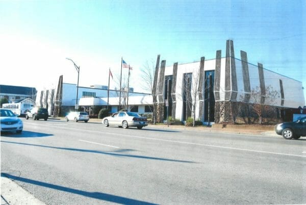
A: Tell me about Design 615’s involvement with the Art & Invention Gallery.
S: We are helping the client for exterior renovations. Currently, the building is vacant, seeking awesome tenants, and this is another example of adaptive re-use, which Christian is big on. We’re taking the existing building, updating it to give it a current look, and making it a design contributor to the Five Points area.
We also have to make the design accessible. It doesn’t meet current accessibility codes in terms of someone in a wheelchair having access to the property. To do that, we are working with Thomas & Hutton here at Center 615 for the civil engineering scope of things.
We’re super excited about the exterior renovation. Right now, it needs love. One of my favorite parts about the facelift will be some really cool 1920s instustrial-style windows that will cover almost the whole façade—made of lots of small square panes with black steel frames. We’re also incorporating wood elements to give it a little bit of an organic nature.
It is Woodland Street, after all.
The mix of finishes with the black, the variety of woods, and the pop of bright teal will make it fun. I think teal is a color that will work really well with the Idea Hatchery units that are already fun colored.
A: Any last thoughts or comments?
S: If anyone in the building needs design help, we offer our services at a 30% discounted hourly rate. We can help you reconfigure your furniture, find new furniture, and things like that. We’ve helped Thomas & Hutton, YouScience, AK Investigations, and ResaleAI.
Center 615 would like to thank Shandi Paro and Design 615 for taking the time to sit down for the interview, in addition to making our co-working space look awesome!
